For OpenGateway, I asked for more font pairings and a side-by-side comparison. The exploration had already produced wordmark specimens. I wanted to see the type working together in a small piece of interface.
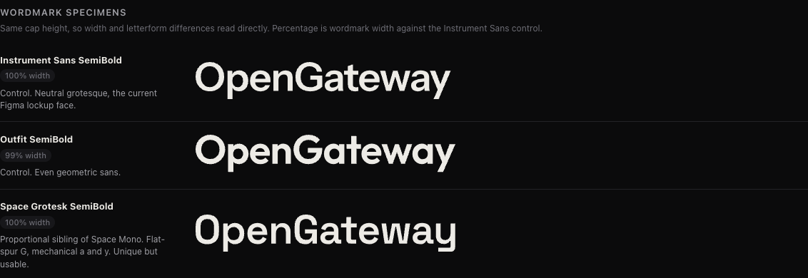
Wordmark specimens from the local design study, captured during review. These are exploration options, not a shipped interface or a final font selection.
The new board has nine pairings. Each repeats the same heading, paragraph, command and button, alongside light and dark versions of the logo. That keeps the content steady while the wordmark, body and monospace faces change.
The first two options make a useful controlled comparison: both use Space Grotesk for the wordmark and heading. One pairs it with Instrument Sans and IBM Plex Mono; the other uses Inter and JetBrains Mono. I can compare the supporting type without changing the logo at the same time.
This remains a local design exploration. The board gives me concrete combinations to compare; choosing the final font system is still open.