The BetterFit design work had moved on, but the iOS app was still carrying the old ember-orange palette and earlier screen layouts. I used this pass to bring the app back into agreement with the Figma direction.1
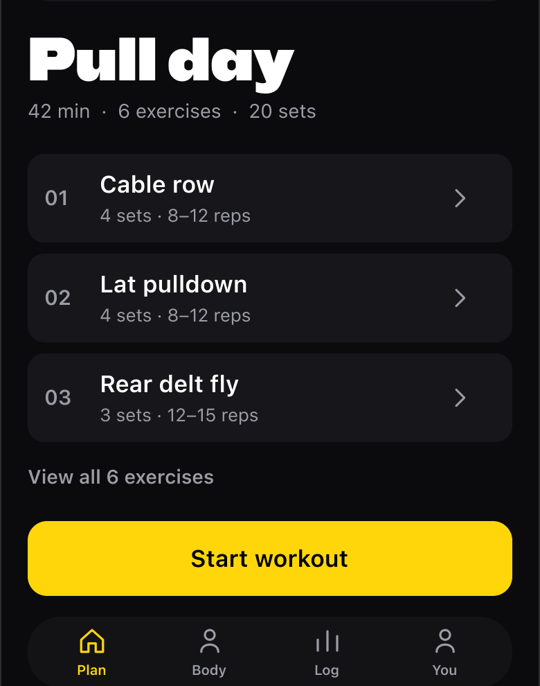
BetterFit's plan-design prototype, showing the exercise rows and yellow actions. This is a design preview rather than a capture of the shipped iOS app.
The identity is now electric yellow, black ink and neutral structure. Instead of giving every status another colour, the yellow ladder uses brightness alongside words. Glass is reserved for floating chrome, and yellow text on light surfaces has its own darker token.
I also added the BFLedger primitives: section rules, readouts, rows, quick actions and the other pieces needed to make the screens feel like one app. WorkoutHome and ActiveSession moved onto those components, alongside the profile, recovery, sign-in and settings surfaces.
More than a palette swap
The workout plan now has inline weight and reps editing, superset pairing and equipment swapping. The active session carries the same direction through set logging, ordering and the rest bar.
This was the app-screens-to-code pass, not proof that every part of BetterFit was finished. The PR also called out twelve pre-existing serious SwiftLint violations in untouched files. Keeping that distinction visible was more useful than making a design sync sound like a clean bill of health for the whole codebase.